If you are a musician or part of a band, you should have a logo. Not all artists realize just how important a logo is for their musical career. This post explains why a logo is a good idea for bands and how you can go about creating your band logo.
Why Your Band Needs a Logo
You might think logos are only for companies or organizations. The truth is, a logo is just a small representation for anyone who wants to use it. Many talented professionals and artists want to stand out from the crowd and use a logo to do that. Band logos are crucial for things like:
- Band T-Shirts
- Show Posters
- Album Covers
- Social Media Profiles
- Bumper Stickers
- Stage Backdrops
- Tour Buses
…you get the idea. These are just a few of the ways your logo will come in handy and help your audience immediately think of you whenever they see it.
Examples of Great Band Logos
There are so many good examples of band logos that use a wide variety of design elements. Here are just a few examples of some classic logos and logo design.
The Rolling Stones
The Rolling Stones are rock icons and you will find their provocative logo on all kinds of things. This tongue-out, lipstick-wearing logo is obnoxious and loud—representing exactly what the band brought to the table.
The Doors
This slab sans serif font offers a weighty, artsy and slightly retro look (though it was very modern when first created). It has aged well, becoming a classic band icon.
All American Rejects
Using just the initials for the band, the AAR logo creates a clear connection to graffiti and other alternative rock bands.
GreenDay
The heart-grenade of the Green Day logo tells a story in the style of stenciled street art and graffiti. Their melodic punk rock is filled with a similar angst and turmoil, so this is a perfect fit.
Prince
This famous logo was so popular with Prince, that he officially changed it to be his name in 1993. But, “The Artist Formally Known as Prince” title got old (how do you pronounce a symbol?), so he went back to the name Prince in 2000.
The Beatles
A classic, The Beatles used a pretty commonplace font and stretched out the “T” to create a classic logo.
Lady Antebellum
Here is another example of changing the font to create something that stands out. Not only is the “L” elongated and curvy with a feminine feel, the “T” creates a horizon line that contrasts it, capped by the larger “A” and “M” on each end.
7 Tips on Creating the Perfect Logo for Your Band
Now that you know how awesome a band logo would be, lets look at the steps to create one. A lot of work goes into the initial steps. If you skip this part, your logo will likely be less effective and not a great representation of your music.
Determine Your Direction
You really need to pin down “who” you are as a group before you can create a logo that lines up with that. This includes your music genre as well as band characteristics that you want to convey to your audience.
It might sound a little tacky, but creating a mood board could be a great place to start. Your mood board would include inspiring images, words, colors and anything that seems inspirational for your band. This mood board will help you get a better visual feel for your group and will serve as the launchpoint for your logo.
Know Your Audience
Once you really know what your band is about and have defined your vibe, you need to pinpoint your audience. Consider factors like:
- Typical audience age
- Other groups your audience listens to
- Interests your audience has outside of music
- Common personality traits of your best audience members
These kinds of details can help you start forming an idea of what your logo could incorporate to be more appealing. If your audience is edgy and likes the fringe, then using lots of black with darker imagery might be the right choice for your logo. If your audience prefers sunsets and acoustic music in a coffee shop, then you are going to take a totally different direction that might incorporate more neutral colors and natural inspiration. If you have an older audience that likes retro throwbacks and smokey jazz lounges, then your logo may use bold colors and smooth design elements.
Find Inspiration
You are starting to narrow down your direction by identifying yourself as a musician and your audience’s preferences. Now, you can start looking for inspiration in things that are related to your group or your audience.
Look for inspiration in the interests your audience has that is relevant to your band. If you are a country band and know your audience likes tractors, fields and cows, then you may take your imagery right from country living. If your audience likes graffiti and street art, then use that style.
You could also get inspiration from other places. Look at brands or bands that your audience loves, browse through music magazines or check out design sites with music logos for inspiration. You won’t want to directly rip off anyone else’s design, but looking at the colors, style, shape and imagery can help you come up with some ideas for your own logo.
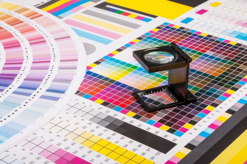
Choose the Right Colors
In most cases, it will be best to keep your color palette limited. Printing your logo on t-shirts, for example, is going to be easier if you only use 1-3 colors.
There is a lot of meaning in color. The right colors are going to help your brand convey its message and vibe before your audience ever hears you play a note.
Consider Imagery
Are you going to use a picture? Think of the Rolling Stone’s mouth or Nirvana’s face—these are classic examples of imagery that helps define the group. Other groups, like Metallica or KISS rely on font alone for their band’s logo. Bands don’t typically use instruments or music-related images for their logos.
While you don’t need to use an image every time or in the final design at all, you should at least consider potential images and how they could impact your band logo design.
Pick Your Fonts
Fonts can be tricky. Too many “fun” fonts make your design look tacky and amateur. But, boring fonts could be forgettable.
You need to choose professional fonts that are easy to read and fit your aesthetic as a brand. The fonts should convey band characteristics, just like your colors, band name and imagery.
Your logo might incorporate one or two fonts, but you should also establish what complementary fonts you will typically use in other nearby places, like the showtimes on a poster. At least one of your fonts should be a more classic font (like Ariel or Times New Roman) to avoid too many fonts fighting for attention.
Select a Shape
Your final shape could be implied by the overall layout or font selection – think about Metallica and how they use the M and A to create a triangle like shape to their logo. It could also be literal, using an outline or enclosing shape. Either way, you need to decide what shape will be most practical based on where you will be using your logo most.
There is a lot of meaning in shapes. We tend to think of unity and potential with circles, but we think edgy and creative with triangles (think of Pink Floyd’s triangle prism logo for Dark Side of the Moon). Squares are dependable and sensible.
Create a Meaningful Logo
Perhaps the most important element of your band’s logo is making it unique. It needs to communicate well and be memorable, but the final design must be something strictly your own.
Your logo will become the visual summary of your band. When done well, this is a powerful marketing tool and visual aid you will use in many formats.